
Bold
Protection
CLIENT
SunPopGo
CATEGORY
Brand Strategy / Packaging Design
DELIVERABLES
Brand Strategy
Logotype
Colour & Typography System
Packaging Design
Graphic Elements
SUNPOP GO! launched in March 2026 with a simple idea: sun protection should be easy to use, easy to trust, and easy to like. COLLECTIVE OSLO worked with the founders to position the brand and developed its logotype and packaging creating a bold and playful expression designed for the whole family.

SUNPOP GO! is made for kids, youth, and grown-ups on the go, whenever the sun is out. The ambition was clear from the start: to make good choices feel easy, clear and intuitive.
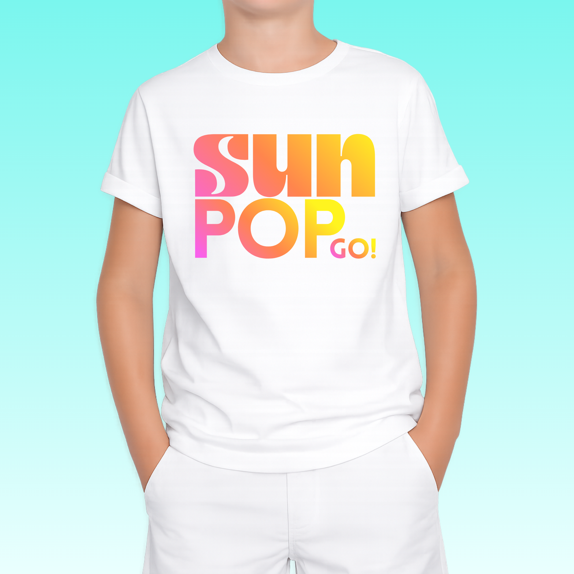
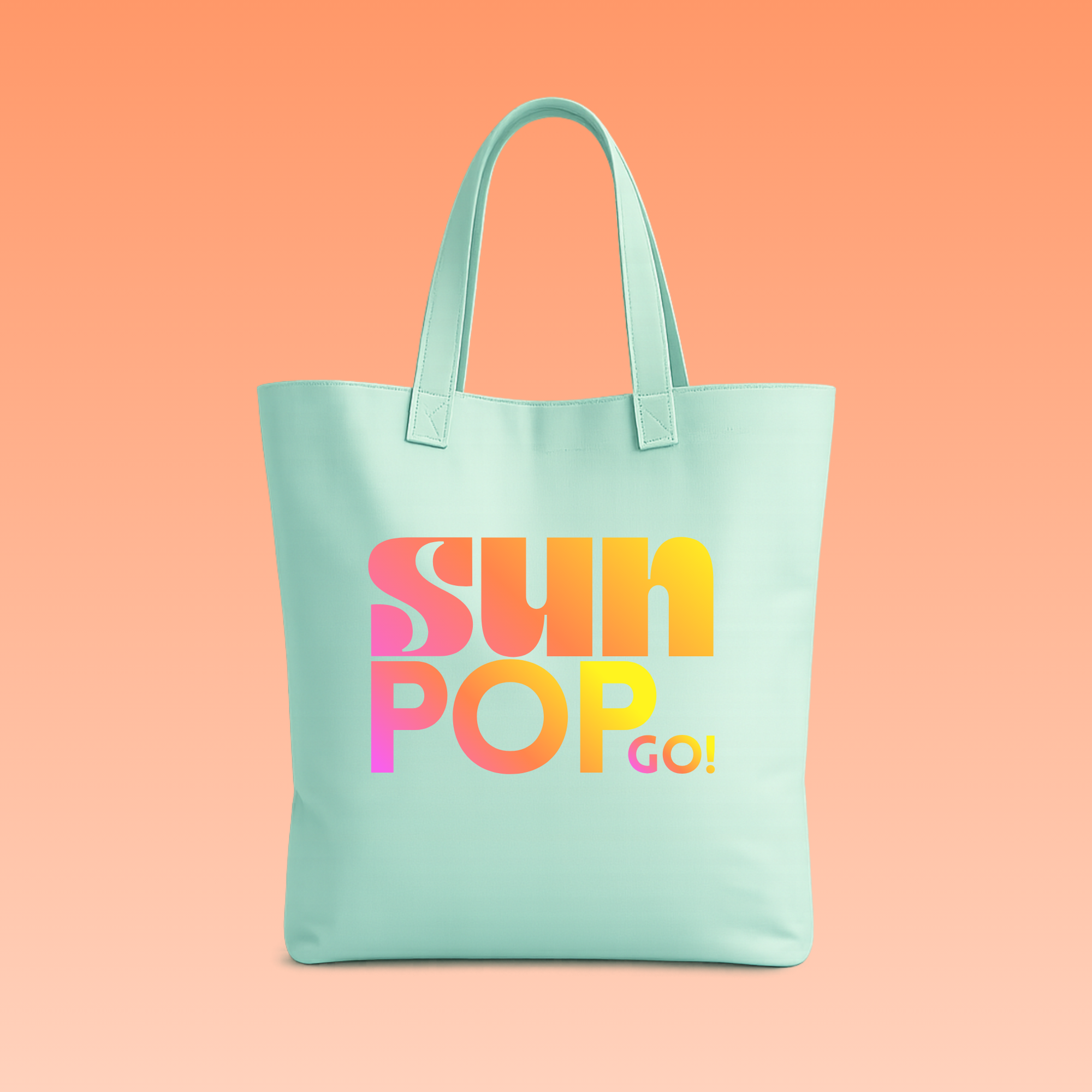
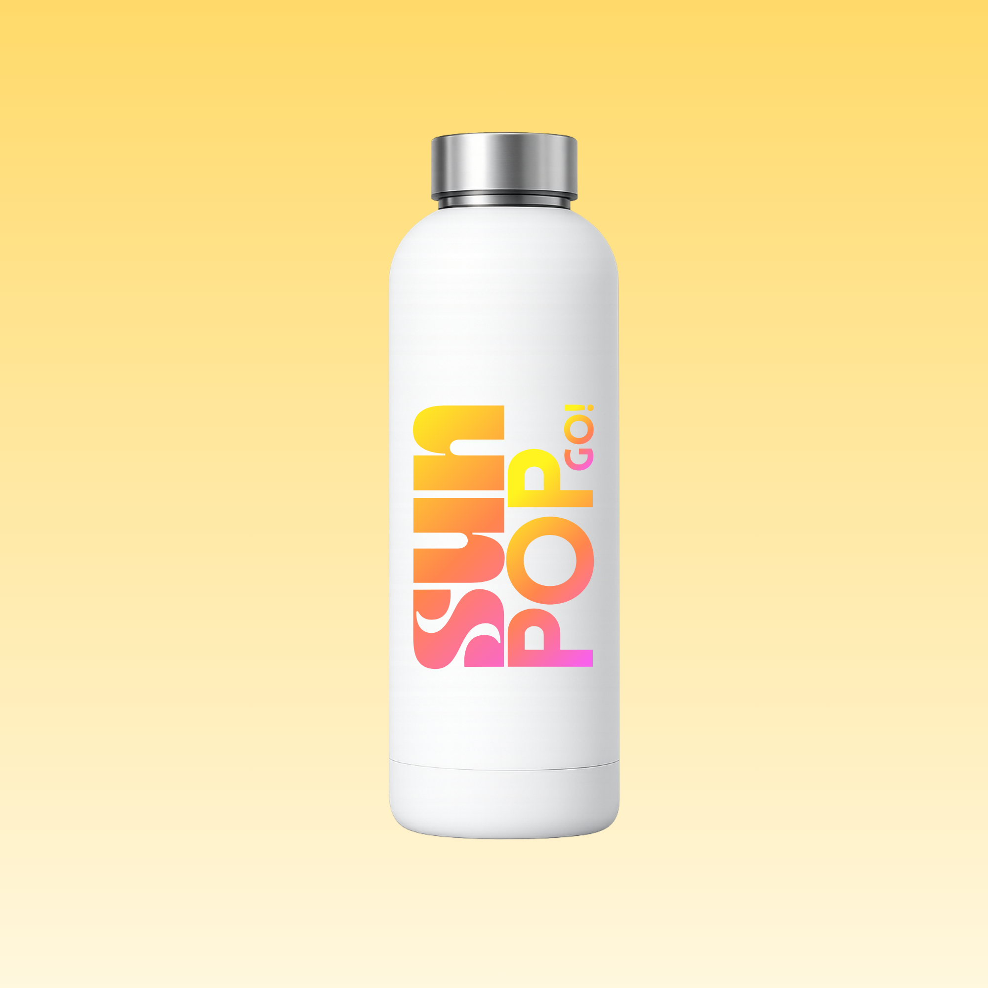
Our role was to position a challenger brand and shape its first expressions, defining the core elements of its visual identity. Starting with what matters most, the product itself, we developed a compact and distinctive identity where the logotype and packaging define the brand from the very first touchpoint; bold, and instantly recognizable.
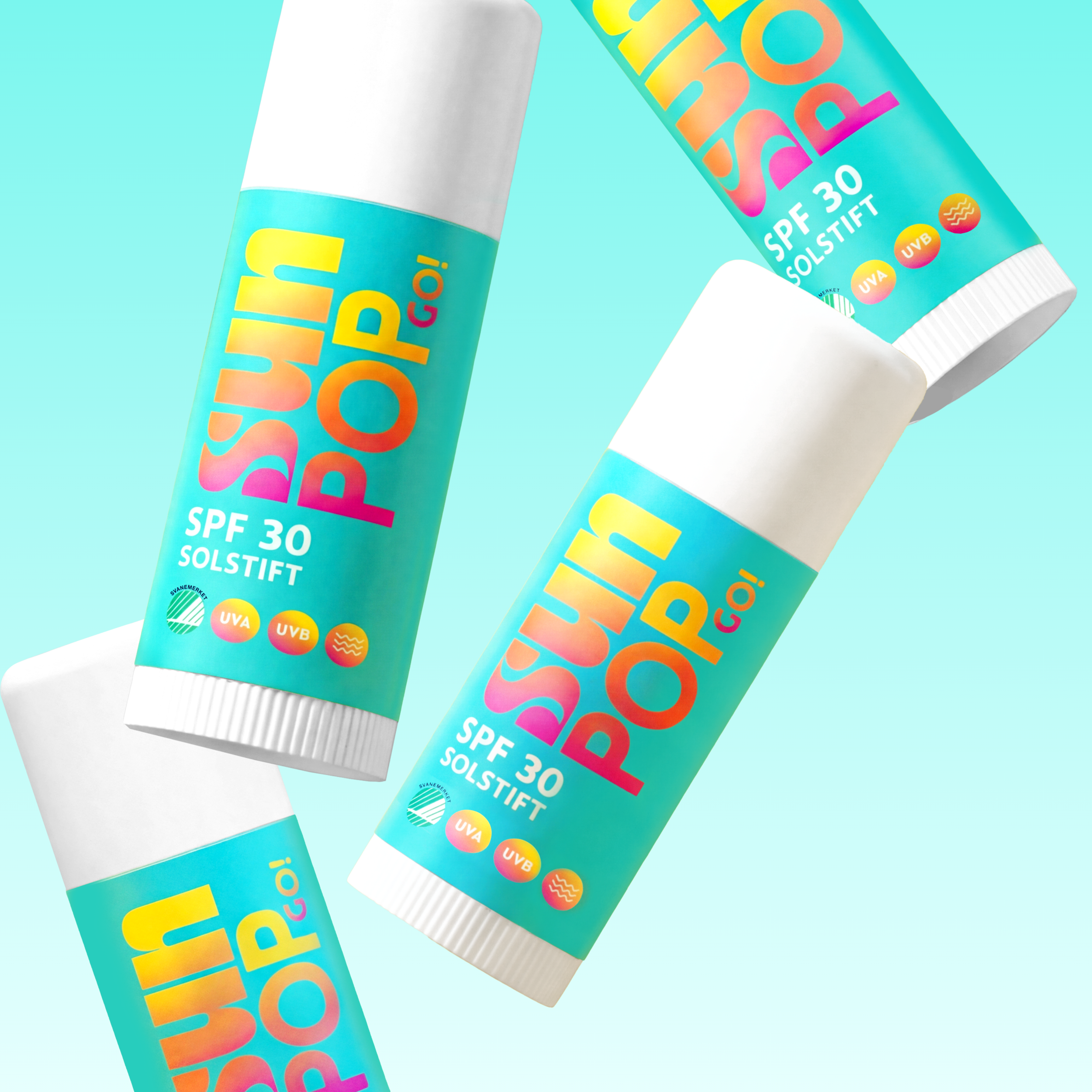
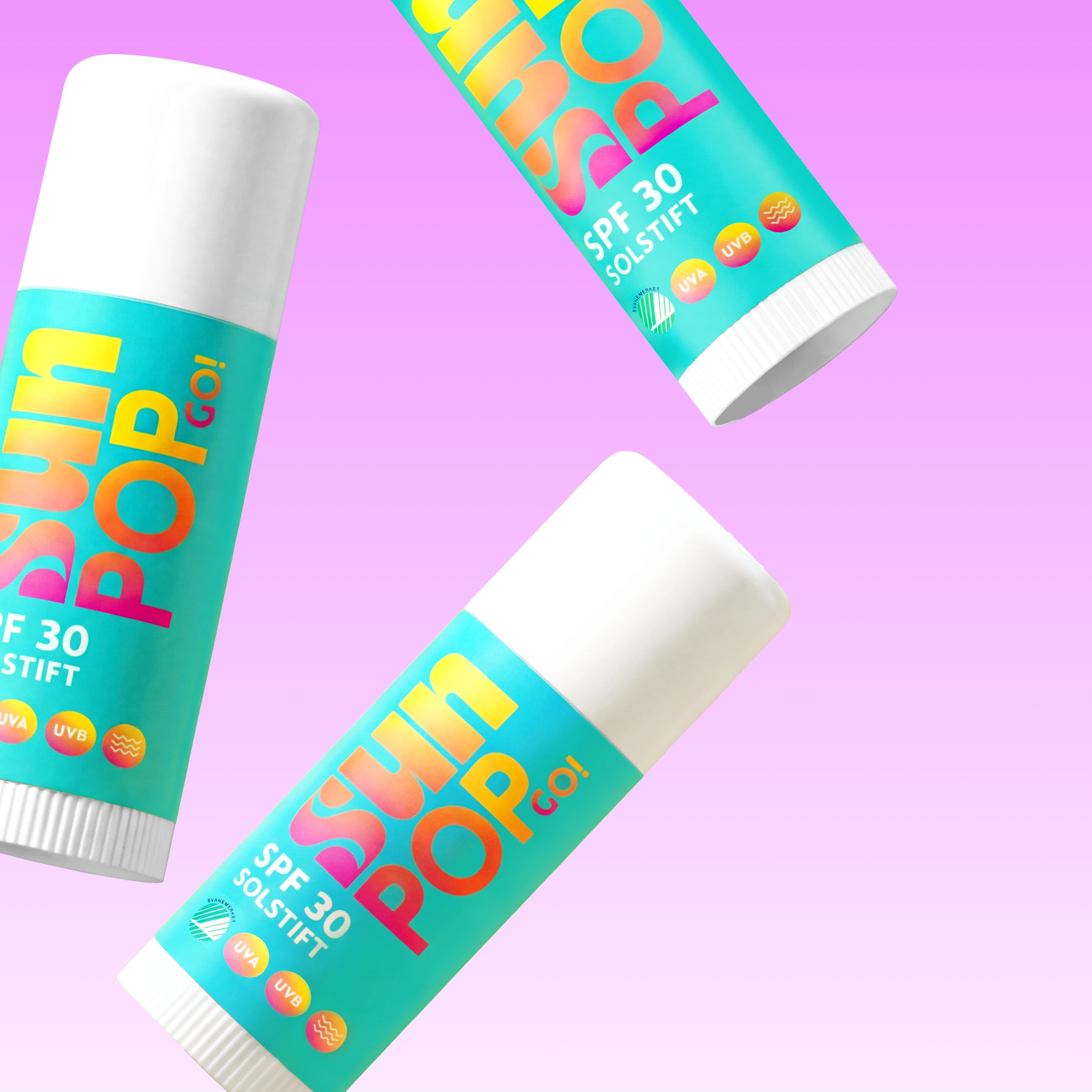
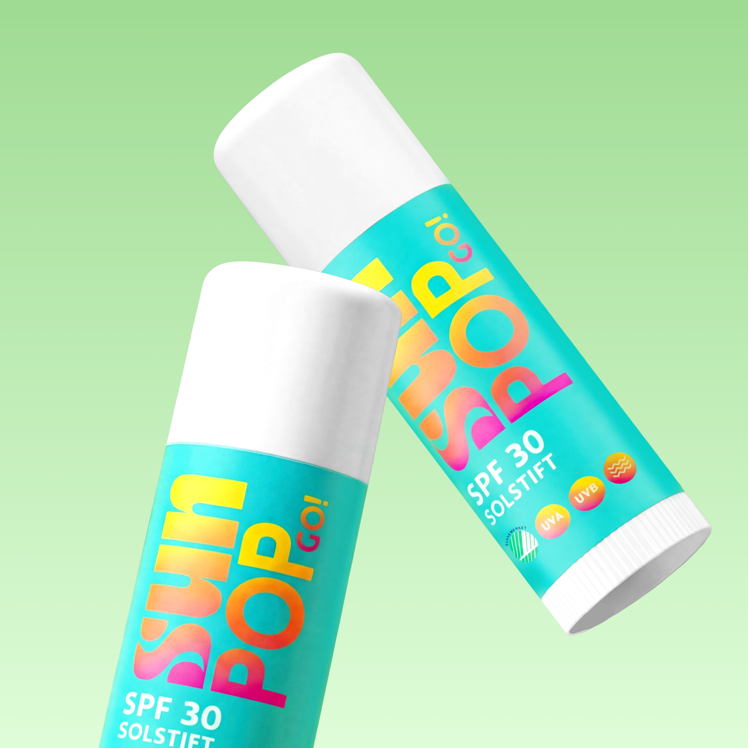


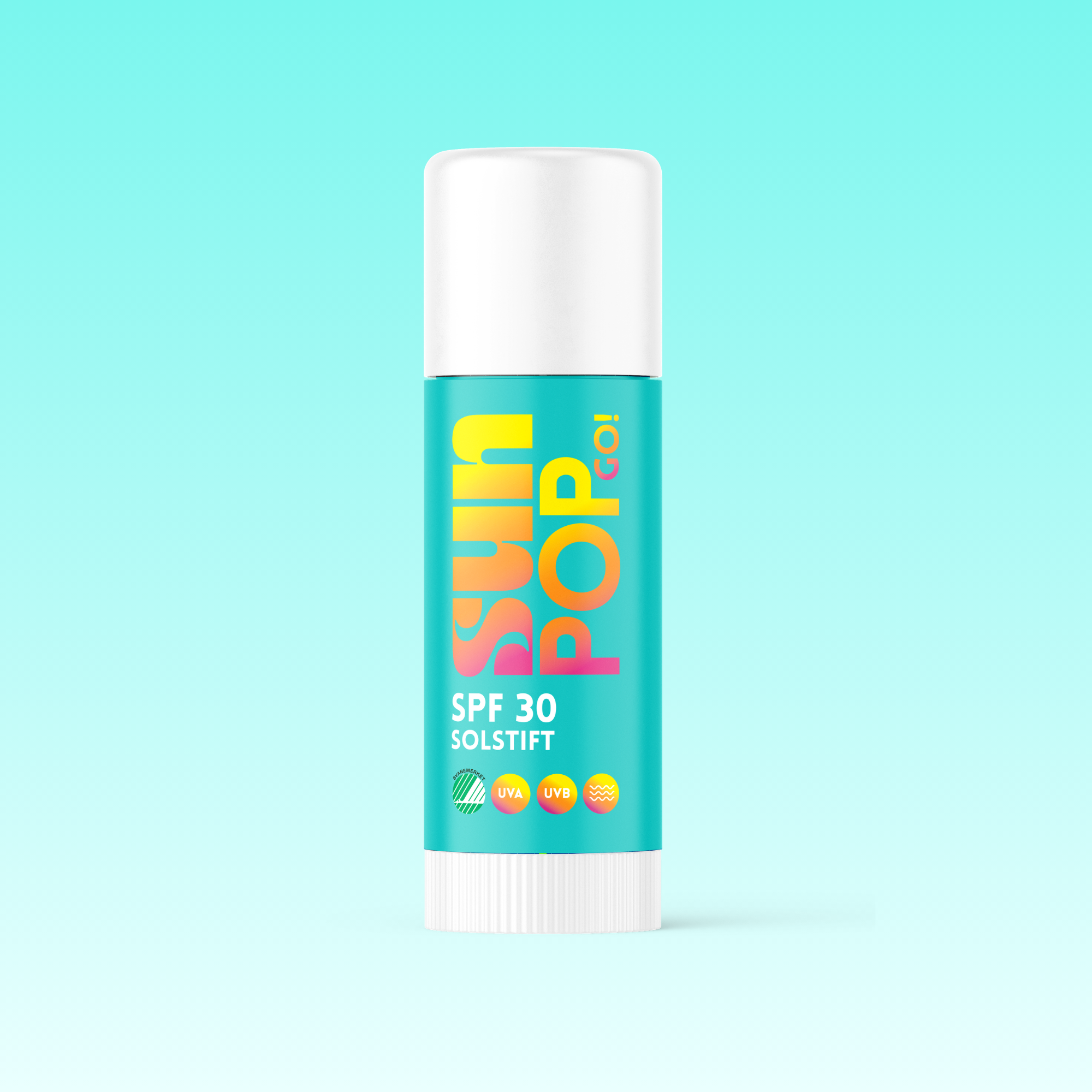
The characteristic typography of the logotype, combined with a bright and energetic colour palette, sets the brand apart and introduces a more playful expression to the category. Together, they create visibility and recognition across formats, while adding warmth and a sense of play.
The packaging is designed with a strong hierarchy, legible typography, and simple graphic elements that make the product easy to navigate and quick to understand.
The result is a brand that feels both safe and fun, built to be used, shared, and liked by everyone.
SUNPOP GO! shows how a focused visual identity centered on logotype and packaging, can create a strong and approachable brand from day one. Bold, simple, and full of energy, the design makes sun protection feel easy.
“Here a quote on the process and results by the founders.”
MARIANNE BERGERUD-WICHSTRØM & MARI EKNES YTRE-ARNE
FOUNDERS, SUNPOPGO